Helping travelers book flights with clarity and confidence
RISE UP AIRWAYS
A UX Project

Project brief

For as long as people have booked flights, they have dealt with confusion and uncertainty. With Rise Up Air, I explored why something so familiar still feels overwhelming and how a clearer experience might change that. This project reflects my early growth as a designer, shaped by research, iteration, and evidence based decisions.

Why does it matter?

Flight booking is a high stakes task. People commit money, dates, and personal information while trying to avoid mistakes. When the interface feels unclear, they slow down, recheck steps, or abandon the process entirely. For airlines, this creates friction and lost conversions. For travelers, it creates hesitation and doubt.
I worked across the full UX process, including competitive benchmarking, usability testing on competitor flows, affinity diagramming, sketches, low fidelity wireframes, and a 43 response A/B test. 

I assembled the final prototype using the strongest patterns and refined my research after senior critique. My focus was on building structured reasoning and grounding every decision in evidence.

Role

User research and analysis, User experience design

Year

2024

Tools

Figma, Google Docs/Form, Zoom

Category

UX Design Institute Project

The problem

Flight booking should feel simple, but most travelers still face uncertainty when choosing packages, add ons, and pricing. My research showed that people were not struggling with the number of steps in the flow.

They were struggling with unclear information, inconsistent pricing, and a lack of guidance that made the process feel unpredictable. The real issue was not missing features. It was a booking experience that did not give travelers the clarity and control they needed to feel confident in their decisions.

Research

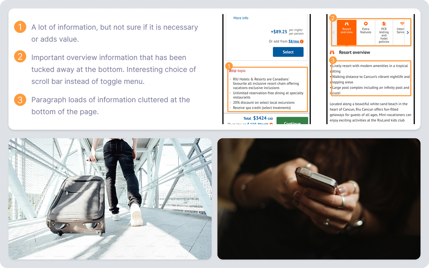
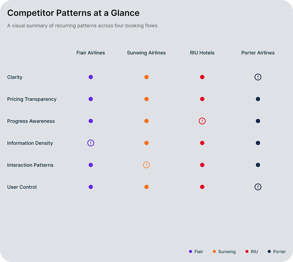
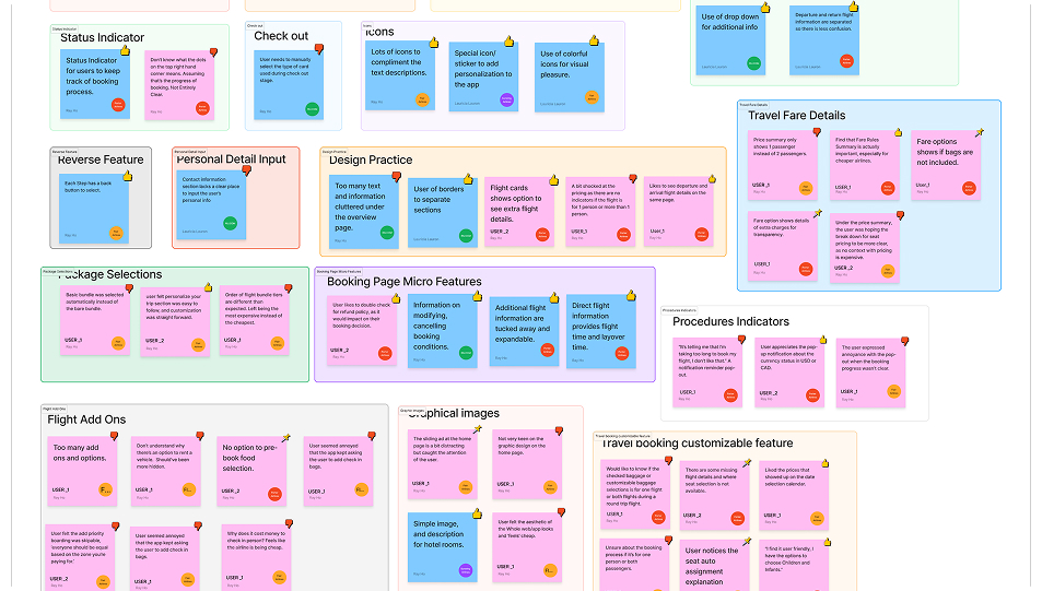
I began by studying how travelers interact with existing Canadian airline booking sites and observing where confusion and hesitation appeared. Competitive benchmarking helped me understand common patterns, familiar conventions, and recurring friction points across different booking flows.

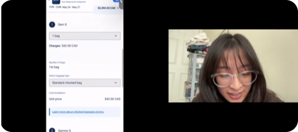
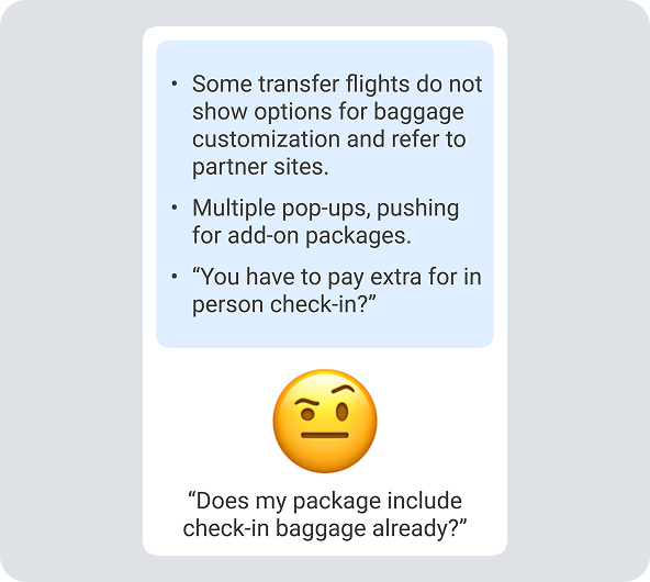
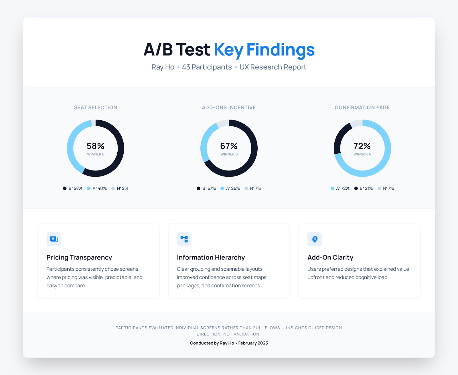
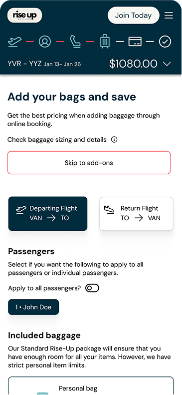
I then ran two usability tests on competitor sites to see how real people interpreted packages, add ons, and pricing. These sessions revealed consistent issues around unclear information, unpredictable costs, and difficulty understanding what was included or extra.

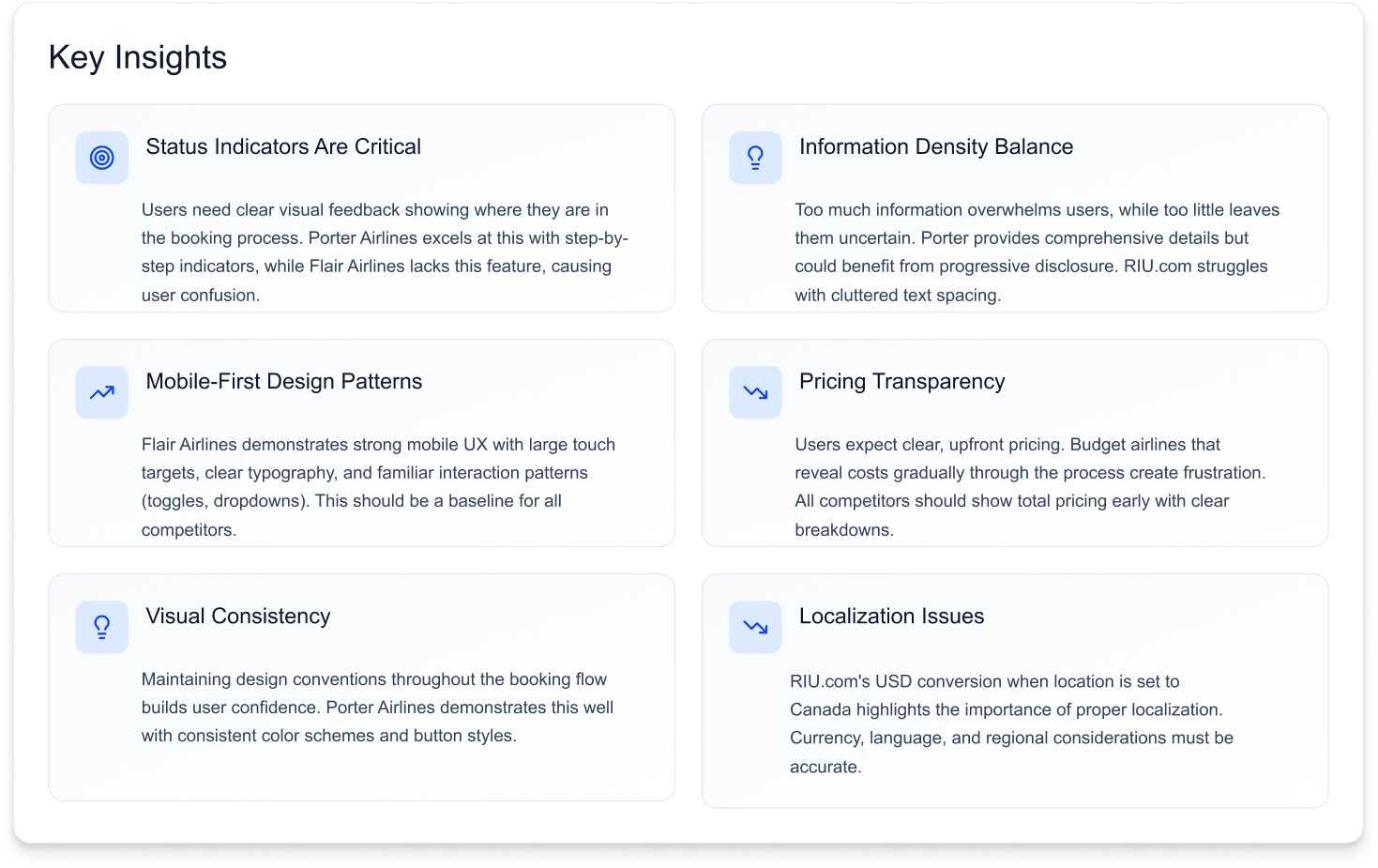
After gathering all observations, I revisited the data and rebuilt the analysis using a triangulated approach, which helped me see the core problem more clearly. Travelers were not struggling with the number of steps. They were struggling with clarity, reassurance, and control.
One of the usability test session on Porter Airlines
Triangulated Insights

Analysis

After gathering all my research notes, I organized the information into an affinity diagram to understand the patterns behind what users were experiencing.

Grouping similar observations helped me see where confusion consistently appeared, especially around pricing, progress, and interaction patterns

Mapping the user journey showed how these issues surfaced across the booking flow and clarified which moments created hesitation and which ones supported confidence.

Features to focus on

Design Process

I organized all research findings into an affinity diagram, which helped me identify patterns around pricing confusion, progress uncertainty, inconsistent interaction patterns, and information overload. 

I explored different interaction ideas through sketches and refined them into low fidelity wireframes that focused on hierarchy, progressive disclosure, transparent pricing, and traveler specific add-ons.

A/B testing Insights

To understand which layouts improved clarity and confidence, I ran a 43 response A/B test comparing two variations of each key screen. 

Participants evaluated how easily they could scan information, understand pricing, and feel certain about their choices. The feedback focused on individual screens rather than the full flow, so the insights guided design direction rather than validating the entire experience. 

The strongest patterns shaped the final design, especially around pricing transparency, information hierarchy, and how add-ons were grouped.

Final design

The final design brings together the strongest patterns from the research and A/B testing. Each screen focuses on clarity, predictable structure, and transparent pricing. Progress indicators help travelers stay oriented, while consistent information hierarchy reduces hesitation. 

Add-ons are grouped by traveler to prevent mistakes, and package details are presented in a way that supports quick comparison without overwhelming the user. The overall flow is designed to feel calm, structured, and easy to follow, giving travelers a clearer sense of control as they move through their booking.

Mobile Experience

I wanted to focus on optimizing the the user experience on mobile. Minimalizing the amount of text in an area, and thinking towards the possibility of one handed use, while ensuring the description for all perks, packages, and details of each add ons are clear for the user to understand their selections and leave no room for ambiguity.

Flight Add ons and Packages

Every little detail counts, such as knowing if the insurance is being applied to one passenger or to both, or if the extra baggage was added to the right passenger.

Being Transparent

As people want to know how they are being charged for extra, and which features are already included in their packages. It’s important to split the different sections into several stages, then providing the final screen for full transparency for the final pricing.

Outcome

The final flow reflects the insights gathered throughout the project, even though the full experience was not tested end to end. The A/B testing helped shape key decisions around layout, pricing visibility, and how information is organized, which led to a more understandable and trustworthy booking experience. 

This project taught me how to separate meaningful patterns from noise, how to use partial validation to guide decisions, and how clarity often matters more than reducing steps. It also reinforced the value of revisiting assumptions and refining ideas through evidence rather than intuition alone.
Previous
Baylink Networks
Next
EVO: Unlock Freedom

Turn Complex Products Feel Simple

arrow-leftarrow-right